📊 Tools Used: Power BI, Power Query, DAX
📅 Project Date: April 2025
💼 Skills Demonstrated: Data Modeling, KPI Design, Sales Performance Analysis, Dashboard Building
🔍 Project Overview
In this project, I created an interactive Power BI dashboard for a fictional retail brand called SuperSales. The objective was to build a data-driven dashboard that enables the business to monitor overall performance and track key metrics like revenue, profit, top-selling products, and region-wise trends.
This is a real-world simulation of how business teams rely on dashboards for insights and reporting.📈 Dashboard Highlights
🧾 Total Sales, Profit, and Quantity Sold
🌍 Region-wise Sales Breakdown with Map Visual
🏆 Top 5 Performing Products by Revenue
📅 Month-wise Sales Trend (Line Graph)
🔎 Category and Sub-category Slicers for filtering
📊 Profitability by Segment and Region
📸 Dashboard Screenshots
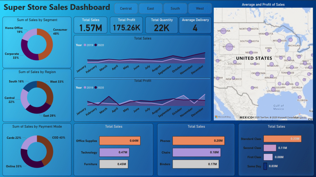
🧠 Business Insights Uncovered
- The West region generated the highest revenue
- Technology was the most profitable category
- Sales peaked during October to December
- Corporate segment had higher order value than others
🔧 Technical Tools & Techniques Used
Used Power Query to clean and reshape raw sales data
Created custom DAX measures for KPIs (e.g. Profit Margin %, Average Sales)
Designed slicer filters for Category, Segment, and Region
Applied professional layout and color consistency for business readability
🔗 GitHub Repository
🙋 About Me
I’m Satyendra Yadav – a Data Analyst and ex-Math Teacher with 2.3 years of experience. I build dashboards and solve real-world problems using Power BI, SQL, Excel, and Python.